Works on the Following Platforms
TradingView
For use on the TradingView platform
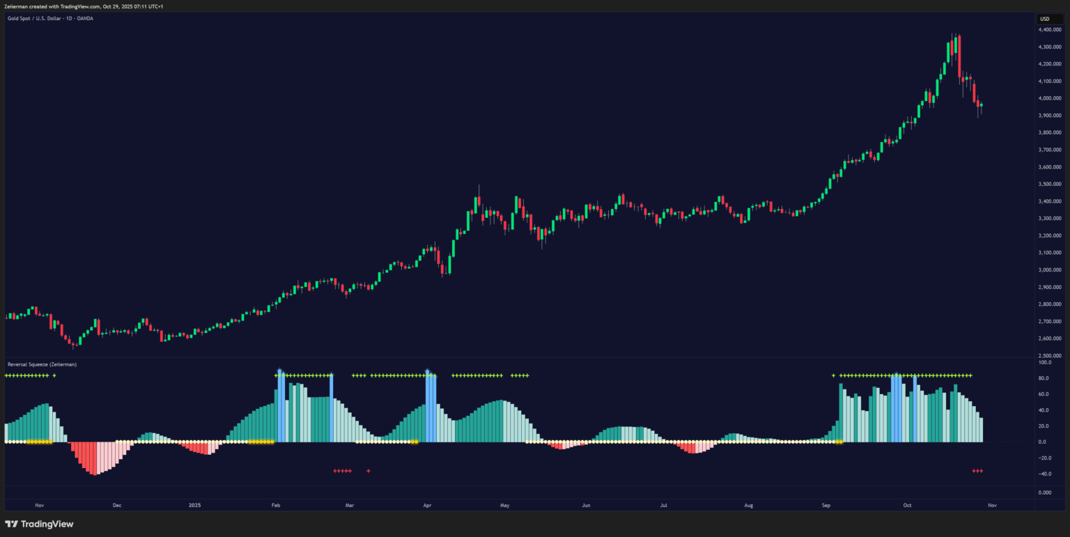
The Reversal Squeeze by Zeiierman is a unique hybrid oscillator designed to detect the transition between trending and inefficient (choppy or reversal-prone) market phases. Unlike traditional momentum tools, it blends price efficiency, volatility adaptivity, and trend behavior to pinpoint moments when markets are compressed (ready to expand) or stretched (ready to reverse).
It gives traders a deeper visual of how efficient price movement really is, helping identify hidden squeezes, reversals, and trend continuations with remarkable accuracy.
Why This Indicator Is Unique
The Reversal Squeeze (Zeiierman) stands out because it doesn’t rely on static momentum or volatility measures alone. It merges price efficiency, trend adaptivity, and volatility compression into one visual system, capable of detecting:
- Early squeeze build-ups and breakouts
- Reversals from inefficiency spikes
- Shifts between clean trends and noisy ranges
- Adaptive behavior across volatility regimes
In essence, it’s a self-adjusting market intelligence tool, revealing when price is efficient, exhausted, or ready to explode.
1. What Is a Squeeze?
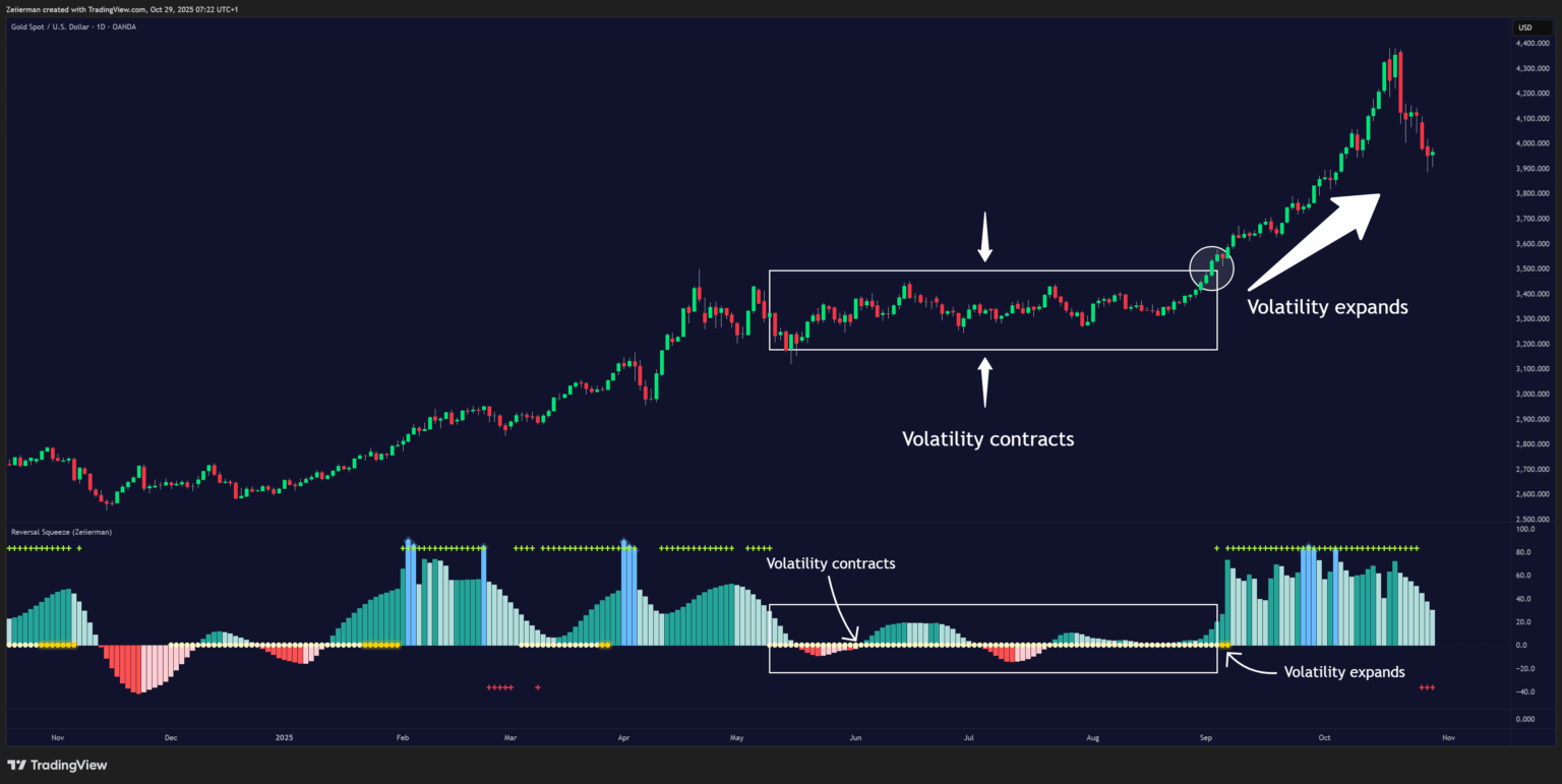
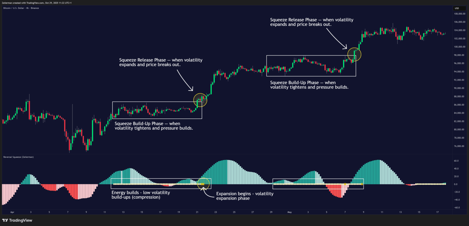
A squeeze occurs when volatility contracts, price becomes tightly coiled, and the market stores energy like a spring. Eventually, that energy “releases” as volatility expands, often leading to a sharp breakout or trend move.
Traditional squeeze indicators (like TTM Squeeze) focus purely on volatility, but the Reversal Squeeze goes deeper: it measures how efficient that build-up is.
This allows traders to spot not only when a squeeze will fire, but also whether the release is likely to sustain or fail.
In the Reversal Squeeze:
- Lighter dots mark low-volatility compression (squeeze build).
- Yellow dots show the release of volatility — the breakout phase.
- Combine these with the histogram and efficiency signals to gauge direction and quality of the expansion.
2. What Is Efficient vs Inefficient Price Action?
Efficient and inefficient price movements are the core philosophy behind this indicator.
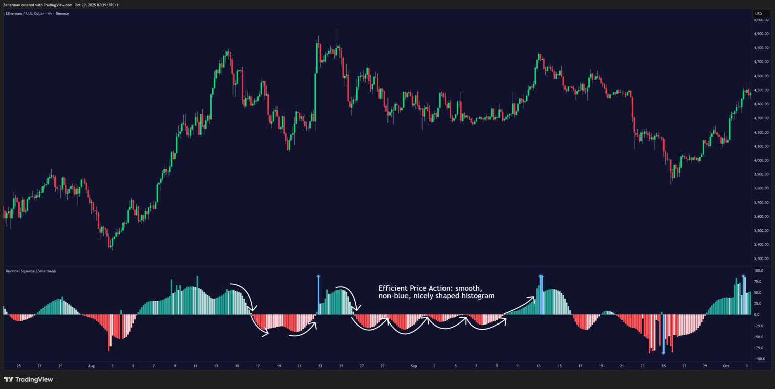
- Efficient Price Action: Efficient moves are clean, directional, and purposeful. Price progresses with minimal back-and-forth noise, showing strong trend conviction.
In the Reversal Squeeze, efficient phases appear as smooth, non-blue, nicely shaped histogram columns positioned clearly on one side of the zero line. These periods reflect strong, healthy momentum and are considered high-probability trend conditions where breakouts and continuations are most likely to succeed.
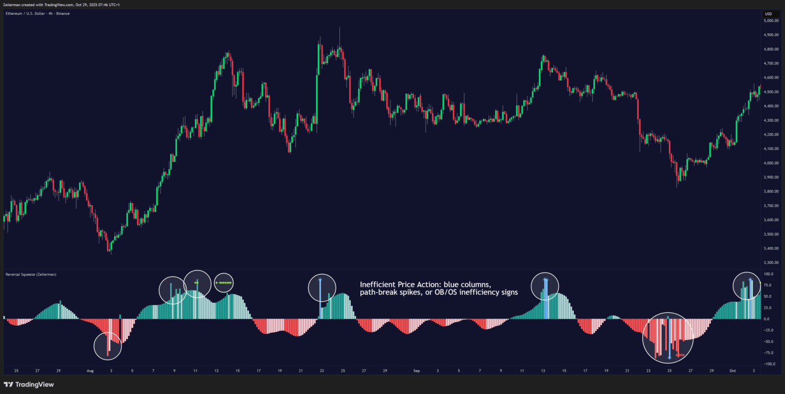
- Inefficient Price Action: Inefficient moves are noisy, erratic, and spiky. They indicate that price is fighting itself — liquidity is thin, traders are emotional, and the move lacks stability.
In the indicator, inefficiency is shown by blue columns, path-break spikes, or OB/OS inefficiency crosses, warning that the current move may be unsustainable or losing structure. These zones often lead to mean reversion, reversals, or false breakouts
3. How to Trade with the Reversal Squeeze
A. Trend Following
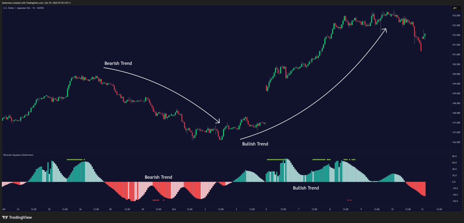
When the oscillator bars are above/below zero and colored in growth shades, momentum is expanding — a sign of trend continuation. When they’re fading, it shows slowing momentum. Traders can ride the trend until a color or zero-line flip signals exhaustion.
- Look for smooth columns staying above/below zero — that’s efficient trending.
- Combine with squeeze release dots (yellow) to confirm strong breakouts.
B. Inefficiency Reversals or Breakouts
Reversal Squeeze thrives in detecting inefficient zones — those spiky transitions when price loses trend efficiency. When bars switch color, or overbought/oversold (OBOS) crosses appear (green/red crosses), it’s a potential reversal zone.
Blue Inefficiency Columns
Blue Inefficiency Column Above Zero: When a blue column appears above the zero line, it indicates that buying pressure is present but inefficient. Buyers are pushing the market upward in an unstable or overextended way, momentum exists, but it lacks structural efficiency. It can also lead to FOMO buying.
This condition often signals that price movement is becoming unpredictable and that a potential reversal, slowdown or quick FOMO buying at breakouts could occur as the market loses its organized bullish structure. In short, it’s a warning that the current upward move may be overstretched or emotional rather than sustainable.
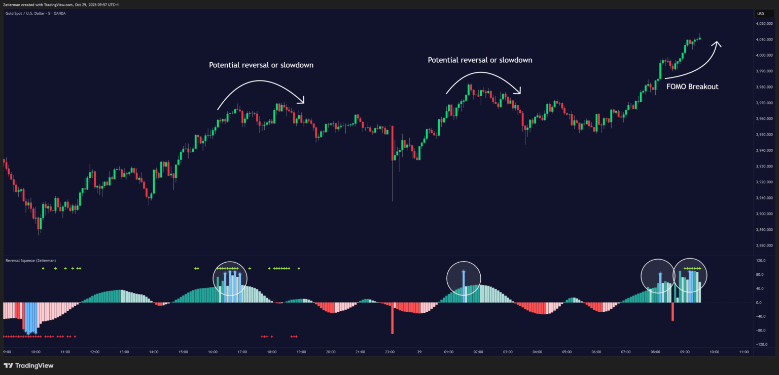
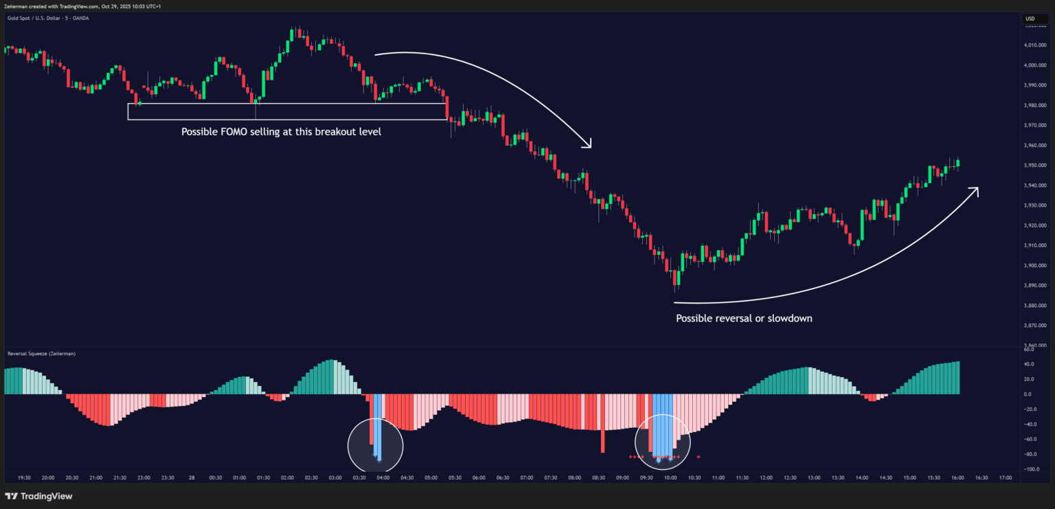
Blue Inefficiency Column Below Zero: When a blue column appears below the zero line, it shows inefficient selling pressure. Sellers are driving prices lower in a disorderly, unstable manner, often with panic or exhaustion.
This inefficiency to the downside suggests that the bearish move may be losing strength, and the market could soon stabilize or reverse upward once efficiency returns. It’s a visual cue that the downside momentum is erratic, and a counter-move or rebound may be forming, though FOMO or panic selling can still occur before the market regains balance.
Main Oscillator Inefficiency
Outbreak / Spiky Column Above Zero: When the main oscillator suddenly surges upward and prints a tall, spiky column above the zero line without turning blue, it signals an inefficient and overextended push to the upside. This type of move breaks the oscillator’s usual smooth curve, showing that buyers are becoming overaggressive or emotional, often driven by FOMO or reactive momentum chasing.
Even though the column remains green, the abrupt path break reveals that the move is losing internal structure and may be unsustainable.Such inefficient upward bursts often indicate upside exhaustion or an overshoot, where the market temporarily loses control.
From here, two scenarios can unfold:
- A sustained breakout if structure confirms (for example, a valid squeeze release or strong volume support).
- A snapback or reversal if follow-through fails on the next bars and the oscillator begins to fade (growth → fall).
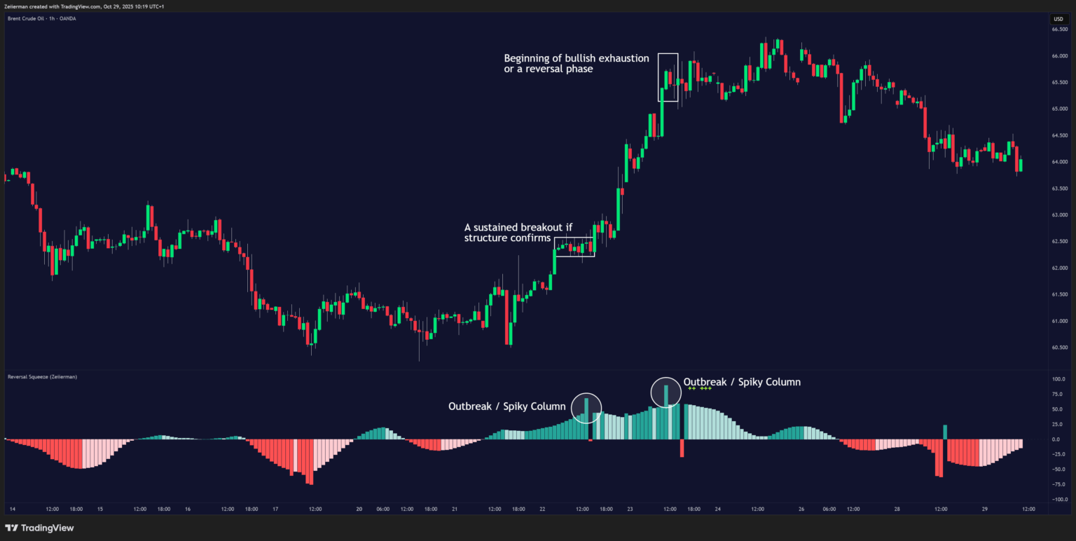
How to read it: The move may be going out of control. Watch key levels and volume closely. If the next bar fails to extend, it often marks the top of an inefficient breakout and the beginning of bullish exhaustion or a reversal phase.
Outbreak / Spiky Column Below Zero: When the oscillator sharply dives and prints a tall, spiky column below the zero line without turning blue, it reflects an inefficient and emotional push to the downside. This behavior typically emerges during panic-driven selling, where traders aggressively dump positions, breaking the oscillator’s normal rhythm.
Even though the color remains red, this kind of path-break spike shows the market has become disordered or overstretched. These inefficient downward thrusts often suggest bear exhaustion, capitulation, or a temporary overshoot below fair structure.
From this point, two potential outcomes can occur:
- A sustained breakdown if the move is supported by strong volume, fresh structural lows.
- A rebound or mean reversion if momentum fails to extend further, indicating that selling pressure has burned out.
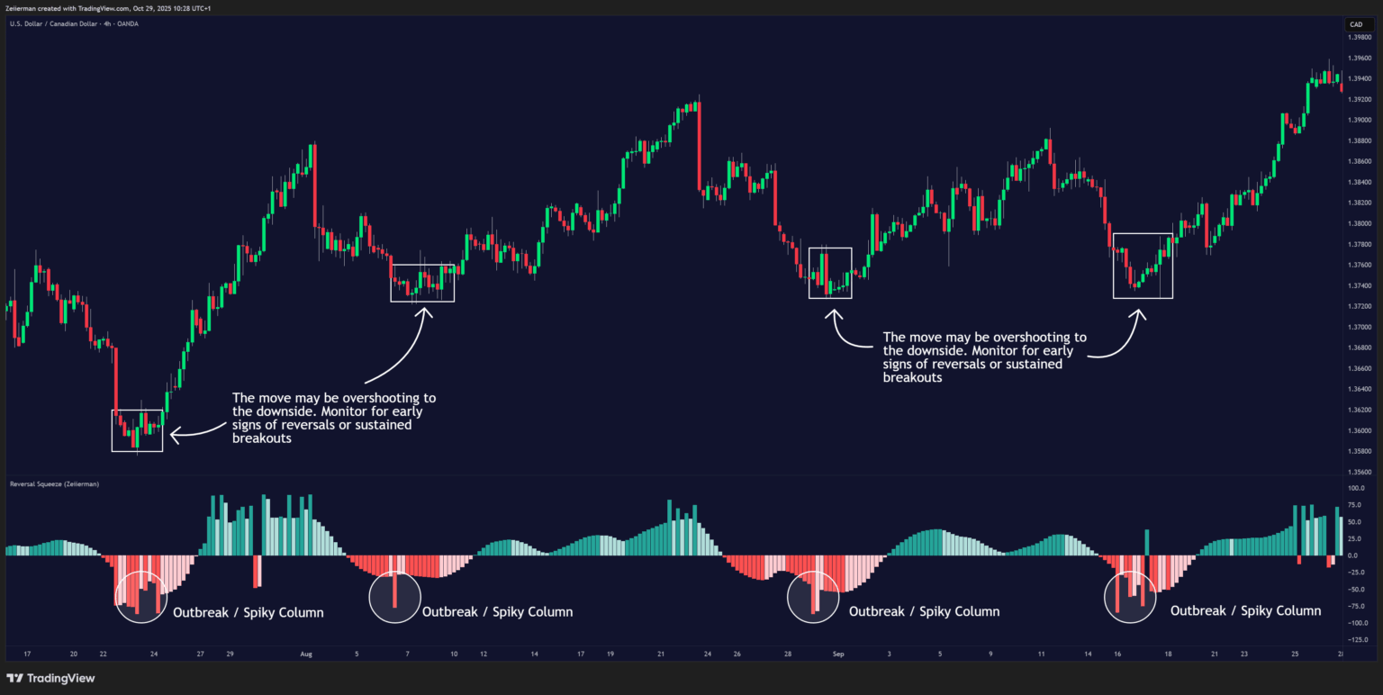
How to read it: The move may be overshooting to the downside. Monitor for early signs of exhaustion, such as smaller columns or a shift from growth to fall below zero. If the next bars begin to shorten or lose momentum, it’s often a sign that the bearish wave is inefficient and ready to reverse.
Setting Tip
If you only want to see the main oscillator peaks without the blue significant inefficiency signals, set the Inefficiency Detection and Inefficiency Duration to the same value.
Then, increase the Inefficiency Price Peaks to fine-tune the sensitivity of the main oscillator’s inefficiency peaks. This helps focus on the core momentum structure and filter out short-term noise caused by minor inefficiencies or emotional price swings.
Overbought and Oversold Inefficiency
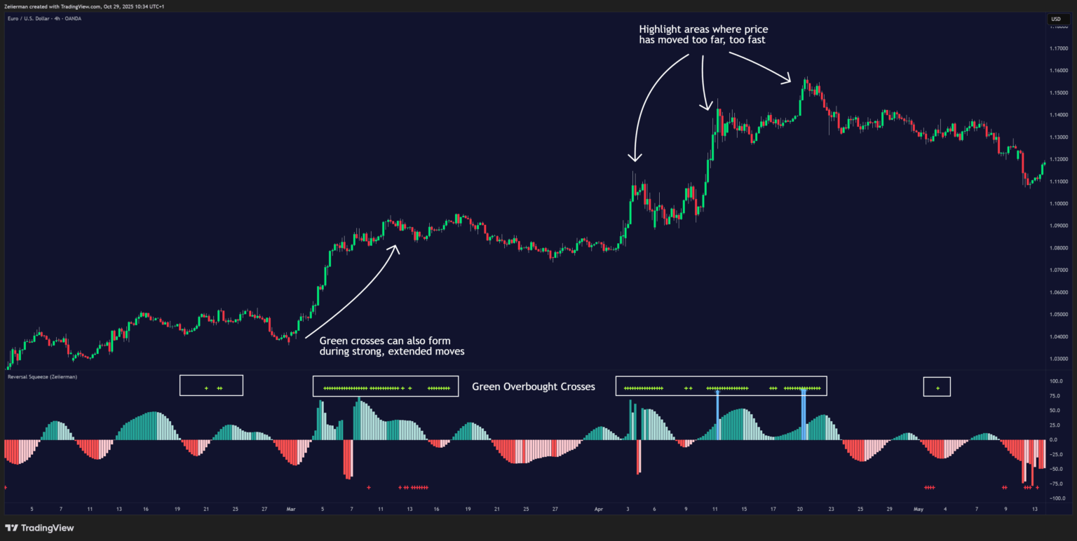
Green Overbought Crosses: When a green cross appears, it marks an overbought inefficiency, a condition where buyers are pushing the market upward too aggressively and inefficiently. These overbought inefficiency signals often appear quickly and highlight areas where price has moved too far, too fast. They frequently lead to a temporary pause, pullback, or even a full reversal, as buying enthusiasm begins to exhaust itself.
Green crosses can also form during strong, extended trends, especially when FOMO (fear of missing out) drives buyers to keep buying into already strong momentum. This behavior represents inefficient buying pressure, traders chasing the move rather than entering on structure.
In these moments, the indicator warns that the market is losing its balance and may soon correct or consolidate.
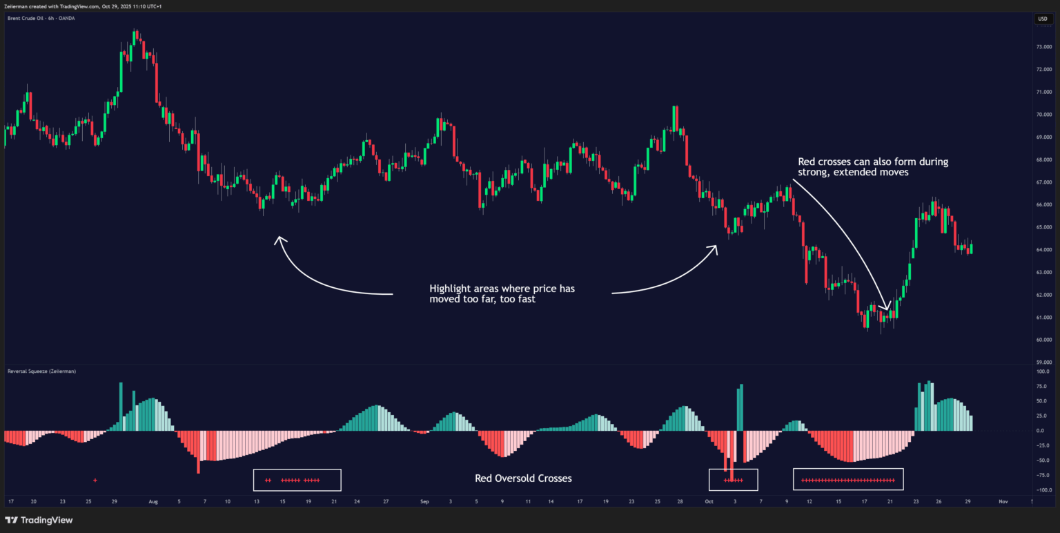
Red Oversold Crosses: When a red cross appears, it marks an oversold inefficiency, a condition where sellers are pushing the market down inefficiently or emotionally. These signals often occur during panic-driven selling, when price drops sharply without proper structure or follow-through. Such inefficient downward moves can’t sustain for long, and they often precede price stabilization or a rebound as selling pressure fades.
Red crosses can also appear in strong downtrends when late sellers or fearful traders enter too late, selling inefficiently into weakness. This usually signals bear exhaustion and warns that the downside momentum is losing efficiency, paving the way for a potential bottom or reversal.
C. Squeeze Builds & Releases (Volatility Expansion)
White dots along the zero-line mark low volatility build-ups (compression). When followed by a yellow dot, a release occurs, signaling a volatility expansion phase.
This is your cue to expect a breakout or new directional move.
- Light dots→ energy builds
- Yellow → expansion begins
- Combine with direction of the oscillator for bullish or bearish bias
4. Simple Strategy: Breakout Trading With Reversal Squeeze
Coming soon!
5. Settings Explained
Base Length
Controls the core lookback period for both the Efficiency Ratio (ER) and the trend component.
- Lower values: Make the oscillator react faster to short-term market movements.
- Higher values: Smooth the oscillator, focusing more on overall structure than quick fluctuations.
Use shorter settings for scalping and longer settings for swing or position trading.
Inefficiency Detection / Duration
These two settings control how easily the oscillator detects inefficiency and how long those inefficiency periods last (displayed as blue columns).
- Detection: Controls how quickly inefficiency is recognized. Lower values make the oscillator detect inefficiency sooner, so blue columns appear more frequently and respond to smaller disruptions in market flow. Higher values make it stricter, meaning inefficiency will only appear during stronger or more extreme conditions, filtering out weaker signals.
- Duration: Determines how long inefficiency remains active once detected. Lower values make blue columns shorter-lived, causing the oscillator to return to normal behavior faster. Higher values make inefficiency last longer, extending the spiky or unstable phase before stability returns.
- In simple terms: If you want the indicator to highlight every small disruption, lower these settings. If you prefer it to focus only on major inefficiency phases, increase them.
Inefficiency Price Peaks
This setting controls how smoothly or sharply the oscillator shifts between normal trending behavior and inefficiency columns.
- Lower values: Make transitions sharper and quicker. The oscillator will switch to blue (inefficient) and back to normal more abruptly, giving faster visual feedback when market behavior changes. Useful if you prefer crisper, high-definition signals that react immediately to shifts in price behavior.
- Higher values: Make transitions smoother and more gradual. The blue inefficiency columns will fade in and out gently, and the indicator will blend more softly between calm and unstable phases. This helps avoid constant color flickering in choppy or sideways markets.
In short: Lower values = faster, snappier changes. Higher values = softer, steadier transitions.
Trend Smoothing
Controls how smooth or reactive the trend component of the oscillator is.
- Lower values: Make the trend component faster and more reactive to short-term changes.
- Higher values: Smooth the trend, making the histogram more stable and better aligned with the main direction.
Squeeze Dots
Toggles the display of squeeze build and release dots along the zero line.
- White dots: Show low-volatility compression (the market is coiling).
- Yellow dots: Show volatility expansion or release (the breakout phase).
Squeeze Sensitivity Settings
These parameters fine-tune how the indicator detects compression and release phases.
- Squeeze Threshold: Defines how tight volatility must be to trigger a white compression dot.
- Min Bars in Compression: Number of consecutive bars that must meet compression criteria before a squeeze is confirmed.
- Max Trend Build Up: Caps how strong the trend is allowed to be during a compression build. Lower values require a muted trend for a white dot to appear (you’ll only see squeezes when direction is truly neutral). Higher values permit stronger trends during compression (you’ll see builds even if the market is still pushing in one direction).
- Release Thresholds: Define how much volatility or momentum expansion must occur for a yellow release to trigger.
OB/OS Inefficiency Crosses
Controls the detection of overbought (green) and oversold (red) inefficiency signals.
- Lower thresholds: Trigger more frequent but smaller OB/OS signals.
- Higher thresholds: Filter out minor inefficiencies, showing only the most significant extremes.
These crosses mark points where price movement becomes inefficient — often near turning zones or exhaustion areas.
6. FAQ: Reversal Squeeze (Zeiierman)
Q1: What makes this different from the classic Squeeze Momentum or TTM Squeeze?
Unlike volatility-only models, the Reversal Squeeze uses price efficiency blended with adaptive volatility logic. It doesn’t just detect when volatility compresses, it understands how efficiently price is moving during that compression. This gives traders early warnings of when a breakout is likely to be genuine or inefficient (fake), improving timing and accuracy.
Q2: What is the “Efficiency Ratio” and why is it important?
The Efficiency Ratio (ER) measures how much of a price move is directional versus random noise.
- High ER: Trend-efficient movement (clean, structured trends).
- Low ER: Inefficient or choppy movement (spiky, unstable).
The ER forms the heart of the indicator’s logic, allowing it to switch intelligently between trend-following and reversal-detection modes.
Q3: What are the blue inefficiency columns and what do they mean?
The blue columns highlight moments when price becomes unstable or erratic. This is where reversals, false breakouts, and shakeouts often occur.
- Blue mode: Price is inefficient — expect noise or exhaustion.
Q4: What are the green and red crosses (OB/OS Inefficiency Signals)?
The green crosses mark overbought inefficiency, and red crosses show oversold inefficiency. They signal that the market has moved too far, too inefficiently, often before a reversal.
- Green (Overbought): Price may bounce or revert upward.
- Red (Oversold): Price may correct or reverse downward.
Q5: What is a “Path-Break Spike,” and why is it important?
A Path-Break Spike occurs when a single column (green or red) suddenly juts out from the oscillator’s smooth pattern, a burst of inefficiency in the same direction as the current move. This usually signals that the market has overextended, the move is inefficient in its own direction.
When followed by color fading or smaller columns, it often marks momentum exhaustion and a potential reversal zone. Think of it as a visual “exclamation mark” that says, “This move went too far, too fast.”
Q6: How can I use the OB/OS crosses effectively?
Treat green crosses as “overbought inefficiency” and red crosses as “oversold inefficiency.” They work best when paired with confirmation signals like:
- A yellow squeeze release dot in the same direction, or
- A histogram flip (from negative to positive, or vice versa). This combination often captures early reversals or trend continuation from extreme points.
Q7: What are the white and yellow dots along the zero-line?
Those are the Squeeze Dots:
- White = Compression (build-up): The market is coiling in low volatility.
- Yellow = Release (expansion): Volatility bursts open, expect directional movement.
Combine them with histogram direction for context:
- Yellow + bars growing above zero = bullish release.
- Yellow + bars growing below zero = bearish release.
They work beautifully with OB/OS crosses or blue inefficiency columns for spotting the exact moment of volatility expansion.
Q8: How can I identify efficient vs. inefficient market behavior?
- Efficient: Smooth, non-blue bars growing consistently on one side of zero.
- Inefficient: Blue bars, erratic spikes, or abrupt “path-break” columns that distort the oscillator’s curve.
Efficient conditions favor trend continuation setups, while inefficient ones favor reversal or mean-reversion plays.
Q9: How can I use white bars with green or red crosses for better trade timing?
When white bars (the squeeze build phase) appear together with OB/OS inefficiency crosses, it often marks a powerful setup forming beneath the surface — a period where the market is compressing while traders act inefficiently.
- White bars + Green crosses → This shows that the market is coiling in low volatility while buyers are inefficiently pushing price higher. It often happens near overbought conditions, signaling that the move upward is losing efficiency. Expect a pause or potential reversal as the squeeze builds, price is stretched, and volatility is ready to expand.
- White bars + Red crosses → This combination means the market is compressing in low volatility while sellers are inefficiently forcing price lower. It often forms near oversold conditions, suggesting that the sell-off is losing strength and that buyers may soon step in. When the squeeze finally releases, it often leads to a bullish breakout or sharp recovery.
In short: White bars show energy building, and OB/OS crosses show where inefficiency is peaking. When they appear together, the market is coiling under pressure — preparing for a major expansion or reversal once volatility releases.
Q10: What alerts are included?
The Reversal Squeeze includes a complete alert suite (1.0–12.x) that covers all critical transitions:
- Oscillator zero-line crosses (trend bias shifts)
- ER inefficiency entries/exits
- Momentum peaks/troughs
- Squeeze build/release events
- Trend strength breaks
- OB/OS starts and ends
- Inefficiency spikes and path-breaks
Q11: Can I use this indicator on all timeframes?
Yes. It works across all markets and timeframes, from scalping to swing trading.
Q12: How is the Reversal Squeeze best combined with other tools?
It pairs perfectly with:
- Range & Trend for directional context
- Adaptive RSI for momentum confluence
- Volume / VWAP for confirmation of real breakouts
Efficiency logic adds a “truth filter”, showing whether other signals occur in efficient (valid) or inefficient (risky) conditions.
Q13: How do I interpret when blue columns and OB/OS crosses appear together?
That’s one of the most telling signals of a market turning point.
- Blue columns → volatility and efficiency instability
- OB/OS cross → stretched market conditions
- Squeeze release or path-break → trigger
Together, they mark the transition from chaos to direction, often right before a breakout or reversal move.
Q14: How do I avoid false signals?
- Avoid fading moves immediately after a strong yellow squeeze release; wait for inefficiency confirmation.
- Use support/resistance or volume levels to validate blue spike or OB/OS setups.
- Watch for path-break confirmation — only act when the next bar fails to extend (color growth → fade).
Patience is key: inefficiency zones give you the edge, but timing refines it.
Q15: What makes the Reversal Squeeze unique overall?
It’s one of the few tools that visualizes market efficiency, not just volatility or momentum. By combining the Efficiency Ratio, adaptive logic, and inefficiency band transitions, it:
- Detects when trends lose structure
- Identifies volatility compressions before breakouts
- Spots reversals from inefficiency spikes
- Adapts to changing volatility in real-time
![Trend Analysis [Ultimate]](https://www.zeiierman.com/wp-content/uploads/2025/03/Trend-Analysis-Ultimate-Update-300x151.png)

