With trading, you either know what to do, or you’re gambling – there’s no in-between. My job is to ensure that you always know what to do.
Over the last 16 years as a trader, I have learned that the right timing is half the game, and the other half is recognizing valid patterns by reading charts. If there’s one thing the markets don’t hide — it’s patterns. The better you are at spotting them, the better your entries and exits will be.
For traders and investors navigating the AI-driven volatility and geopolitical uncertainty of 2025, reading chart patterns correctly has become increasingly challenging. That’s where technical analysis tools, such as the scripts and indicators created by Zeiierman Trading, come into play.
Here’s the thing: successful traders don’t just guess; they read the signs and act on confluence. Today, I’m breaking down the 11 most reliable chart patterns that we use to stay ahead of the game.
Reversal Patterns: When Trends Change Direction
Reversal patterns emerge when trends lose momentum. Primarily, these patterns signal shifts from bearish to bullish momentum (or vice versa). Whether you’re swing trading or investing longer term, these patterns can save you from buying at the top or selling at the bottom.
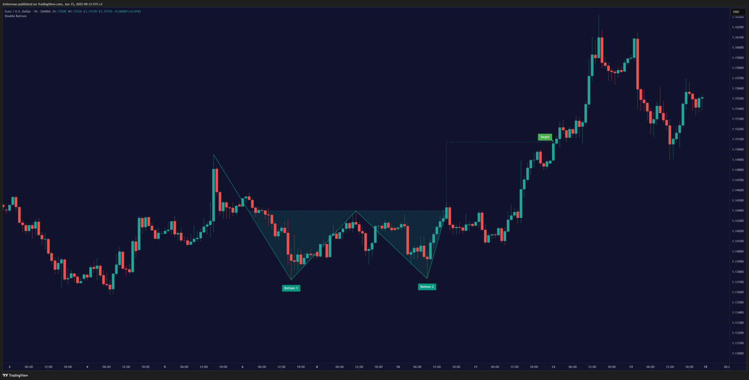
1. Double Top and Double Bottom
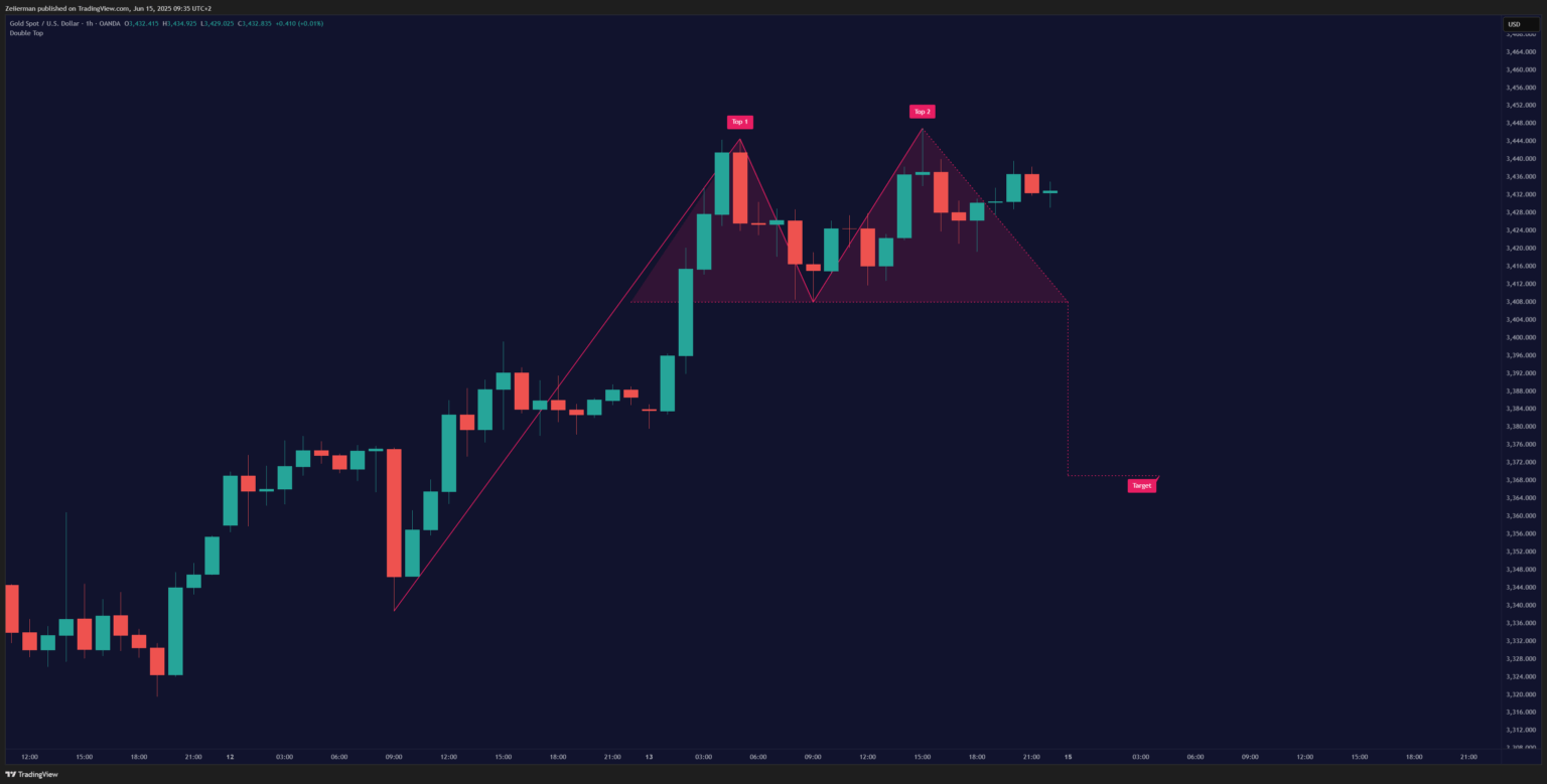
Let me explain this one with the double top, you can basically flip the entire script for the double bottom. The double top looks exactly like it sounds – two peaks sitting at roughly the same height.
This bad boy shows up after an uptrend and screams, “Party’s over!” In a double top pattern, the price reaches a high, pulls back, and rallies to retest that same high but fails to break through it. It’s like a basketball player jumping twice to dunk but coming up short both times.
The second peak often shows a divergence in volume (lower than the first peak) and momentum oscillators like RSI. This indicates exhausted buyers and impending seller dominance. You can use our Oscillator Toolkit to get a comprehensive view of the divergences.
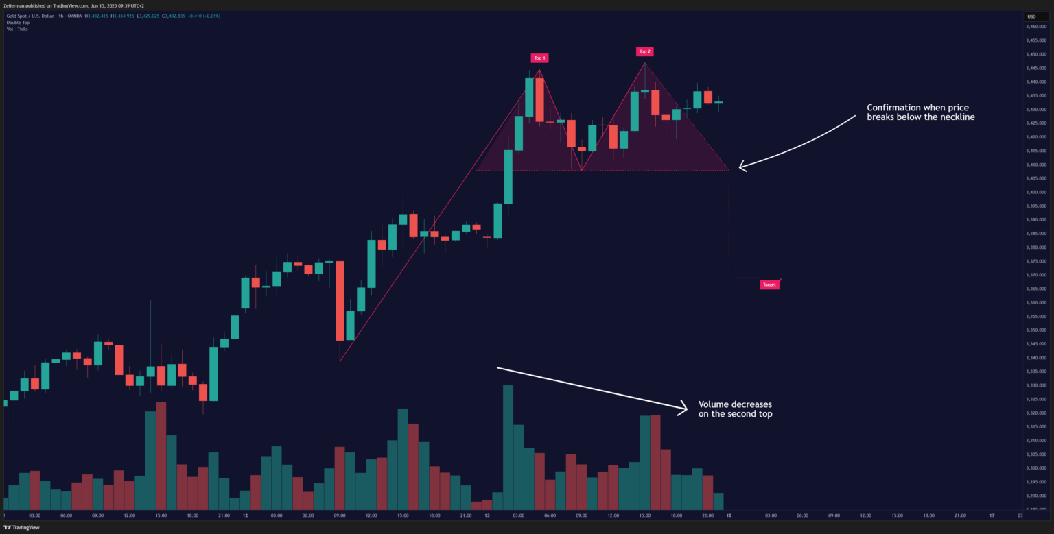
Here’s what to watch for:
- Two distinct peaks at similar price levels
- A valley (neckline) between the peaks
- Volume typically decreases on the second peak
- Confirmation comes when the price breaks below the neckline.
📌 Wait for that neckline break before jumping in. Too many traders get excited and enter early, only to watch the pattern fail.
Read: Why TradingView is Perfect for Beginners in 20252. Falling and Rising Wedges
Wedges are sneaky little patterns that look like triangles on a diet. They’re essentially being squeezed between two converging trendlines, but unlike regular triangles, both lines slope in the same direction.
There are two types of wedges to look out for:
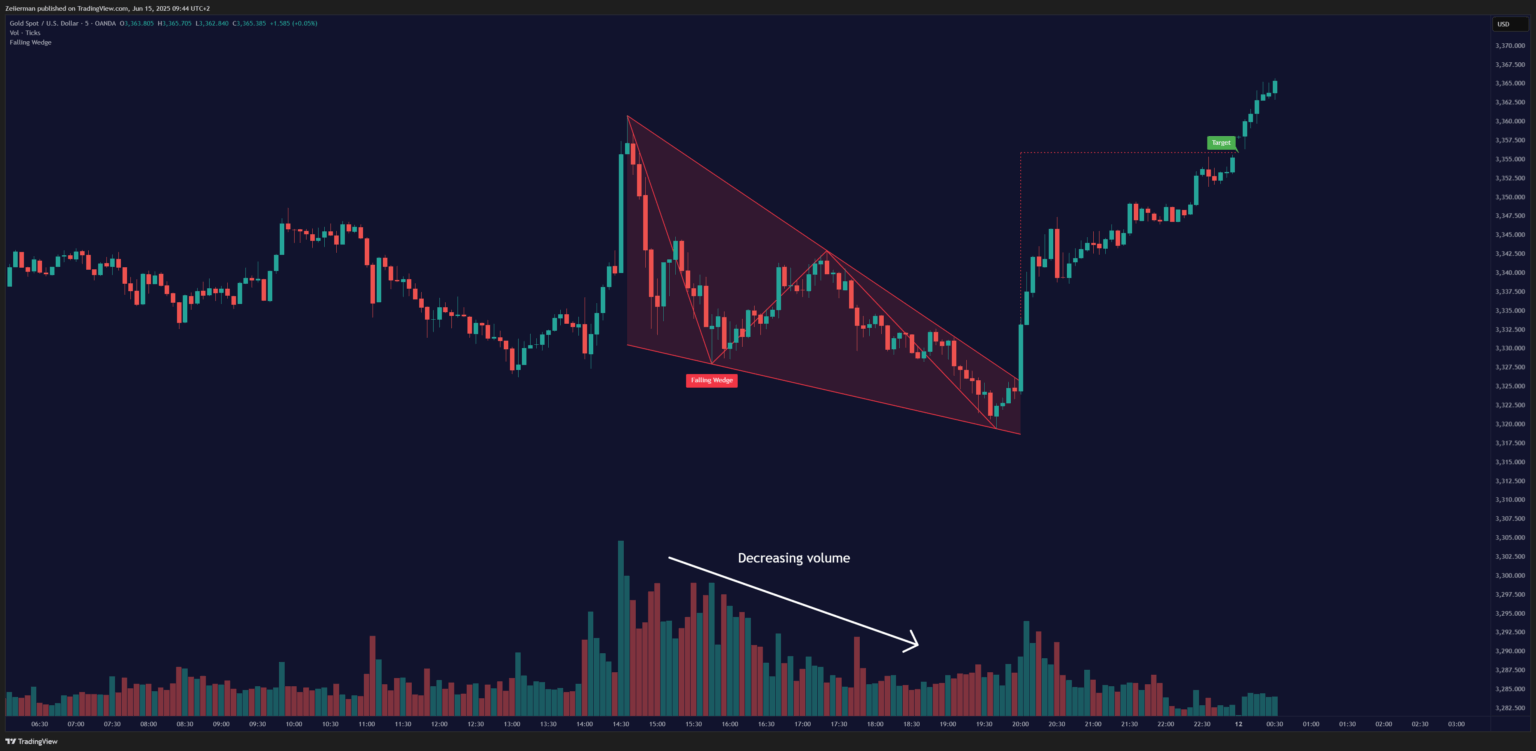
Falling Wedge: Often mistaken for bearish continuations, a falling wedge features converging, downward-sloping trendlines with lower highs and even steeper lows. It traps aggressive shorts as supply dwindles, leading to explosive breakouts. To trade falling wedges, you gotta enter long on a breakout above the upper trendline. The stop-loss is usually applied below the most recent low. And our target is the sum of your entry point and the widest pattern width.
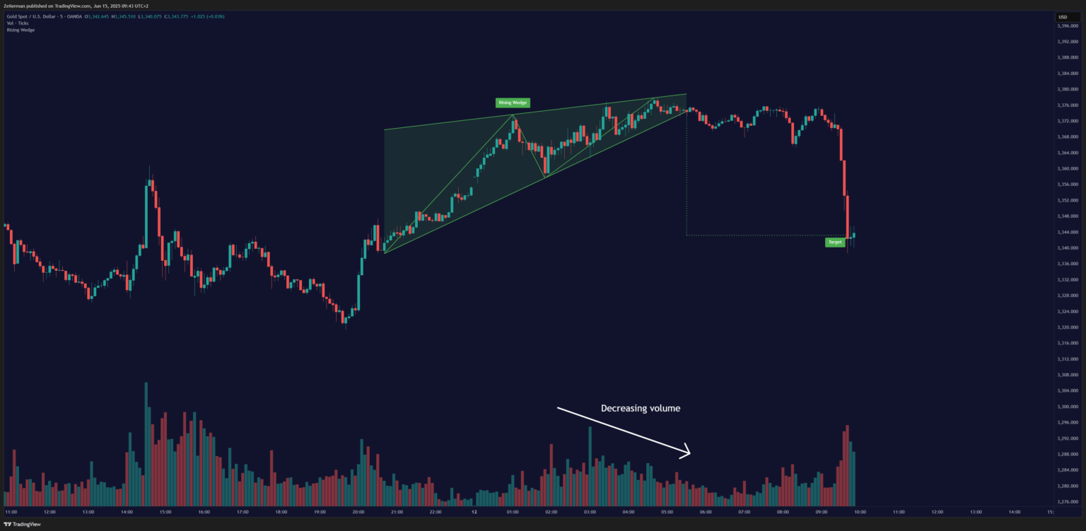
Rising Wedge: This pattern is the opposite – an upward-sloping trend where both highs and lows are rising, but the highs are rising at a slower rate than the lows. Despite the upward slope, this pattern is bearish in nature, and decreasing volume signals weakening conviction before breakdowns. To trade rising wedges, I often go short on a close below the lower trendline and keep the stop-loss above the last high. My target for a rising wedge is the breakdown point minus pattern height.
Wedges trap traders. Breakouts from wedges often happen fast, and the moves are usually strong. To successfully spot and trade wedges, you can take the help of our (rather unique) ATR + PSAR Trailing Stop indicator.
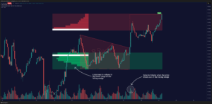
3. Head and Shoulders Pattern
If chart patterns had a Hall of Fame, head and shoulders would be the MVP. This three-peak formation is one of the most reliable reversal patterns you’ll encounter in 2025.
After an uptrend, the price forms a peak (shoulder), a higher peak (head), and a lower peak (second shoulder). The break of the neckline is, more often than not, a strong bearish signal. Here, the left shoulder and head form successive peaks, but the right shoulder fails to match the high, confirming distribution (smart money exiting). The neckline break subsequently triggers mass sell orders.
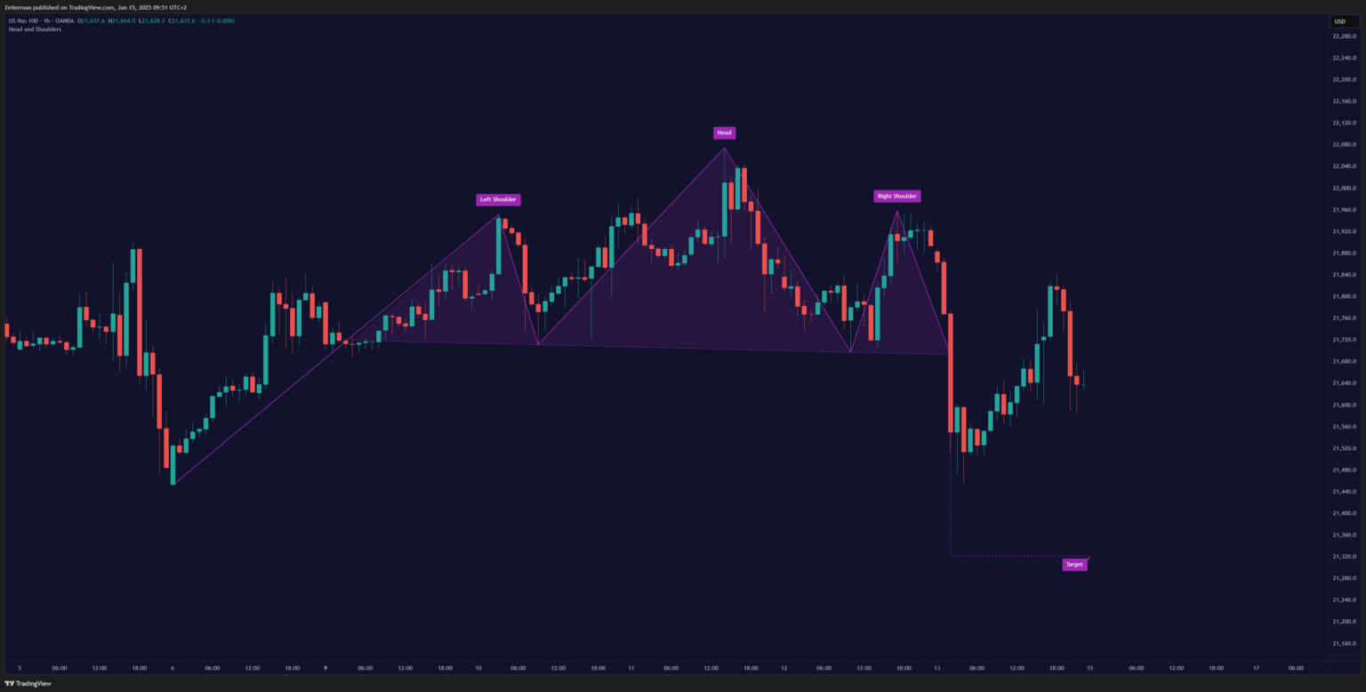
Here’s the breakdown:
- Left shoulder: Price rallies and pulls back.
- Head: Price rallies higher than the left shoulder, then pulls back.
- Right shoulder: Price rallies again but fails to exceed the head’s height.
- Neckline: The support level connecting the two pullback lows.
And then there’s the Inverse Head and Shoulders: Flip it upside down, and you’ve got the bullish version. Three valleys, with the middle one (head) being the deepest. The deep “head” valley shakes out weak holders before institutions accumulate. This pattern marks the end of a downtrend and the beginning of an uptrend.
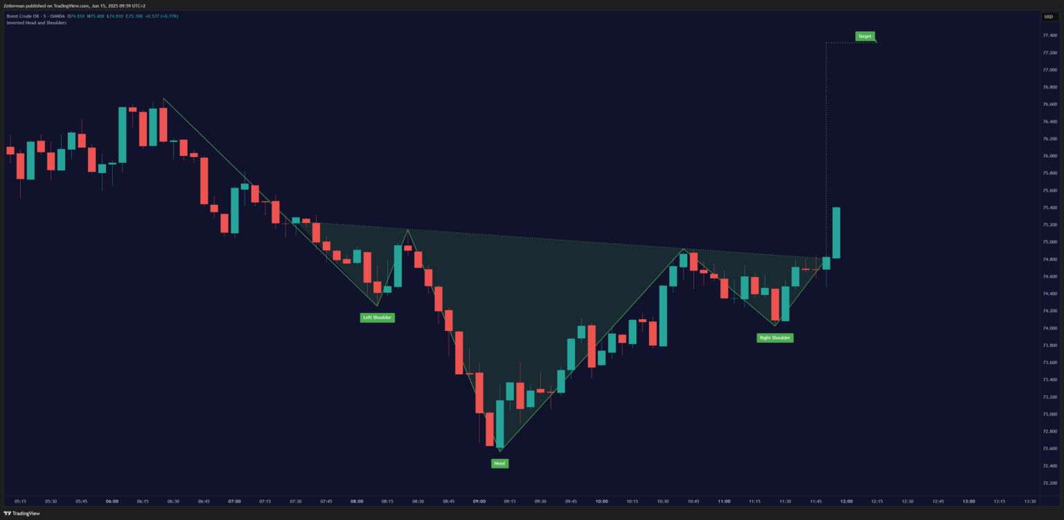
📌 The more symmetrical the shoulders, the stronger the pattern. Do not look for the pattern everywhere. I ALWAYS stick to a higher timeframe and confirm with volume and other indicators, such as Price & Volume Profile and Reversal Algo.
4. 2B Pattern
This one’s for the sharp-eyed traders. The 2B reversal pattern occurs when the price breaks a recent high (or low) but quickly fails and reverses. It’s a false breakout setup that savvy traders like you and I love.
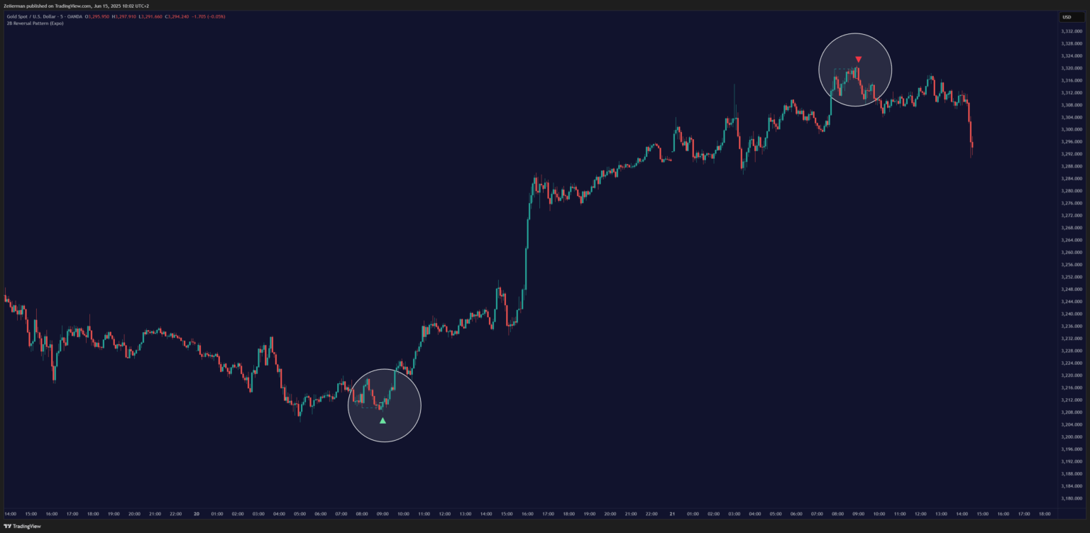
Why 2B Patterns Matters: Markets often deceive retail traders. The 2B pattern helps you spot these traps early.
Here’s how 2B pattern forms in a bearish market:
- Price makes a new high above the previous swing high
- Price fails to sustain the breakout
- Price closes below the previous swing high within a few bars
Here’s how 2B pattern forms in a bullish market:
- Price makes a new low below the previous swing low
- The price quickly reverses and closes above the previous swing low
The 2B pattern catches all those traders who jumped on the breakout, then yanks the rug out from under them. It’s brutal but profitable if you’re on the right side.
Read: 2B Reversal Pattern Trading Strategy Explained: How to Enter, Exit and ProfitContinuation Patterns: The Pit Stops of Trending Markets
Continuation patterns are like rest stops on a road trip. The market takes a breather but continues to head in the same direction regardless. These patterns are gold mines for trend followers. Smart investors will use these to re-enter strong trends with better timing.
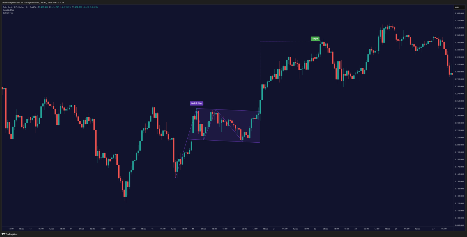
5. Bullish and Bearish Flags
Flags are probably the easiest patterns to spot once you know what to look for. They look exactly like flags on flagpoles – a sharp move (the pole) followed by a rectangular consolidation (the flag). Why do I love them, you ask? Flags are clean and quick signals when looking for continuation in the market.
Bullish Flag: After a strong upward move, the price consolidates in a slightly downward-sloping rectangle. Remember that volume typically dries up during flag formation, as the pole represents the initial upward move, and the flag represents consolidation.
Bearish Flag: It’s the same concept, but in reverse – after a sharp decline, the price consolidates in a slightly upward-sloping rectangle before continuing its downward trend. Here, the sellers reload before the next leg down.
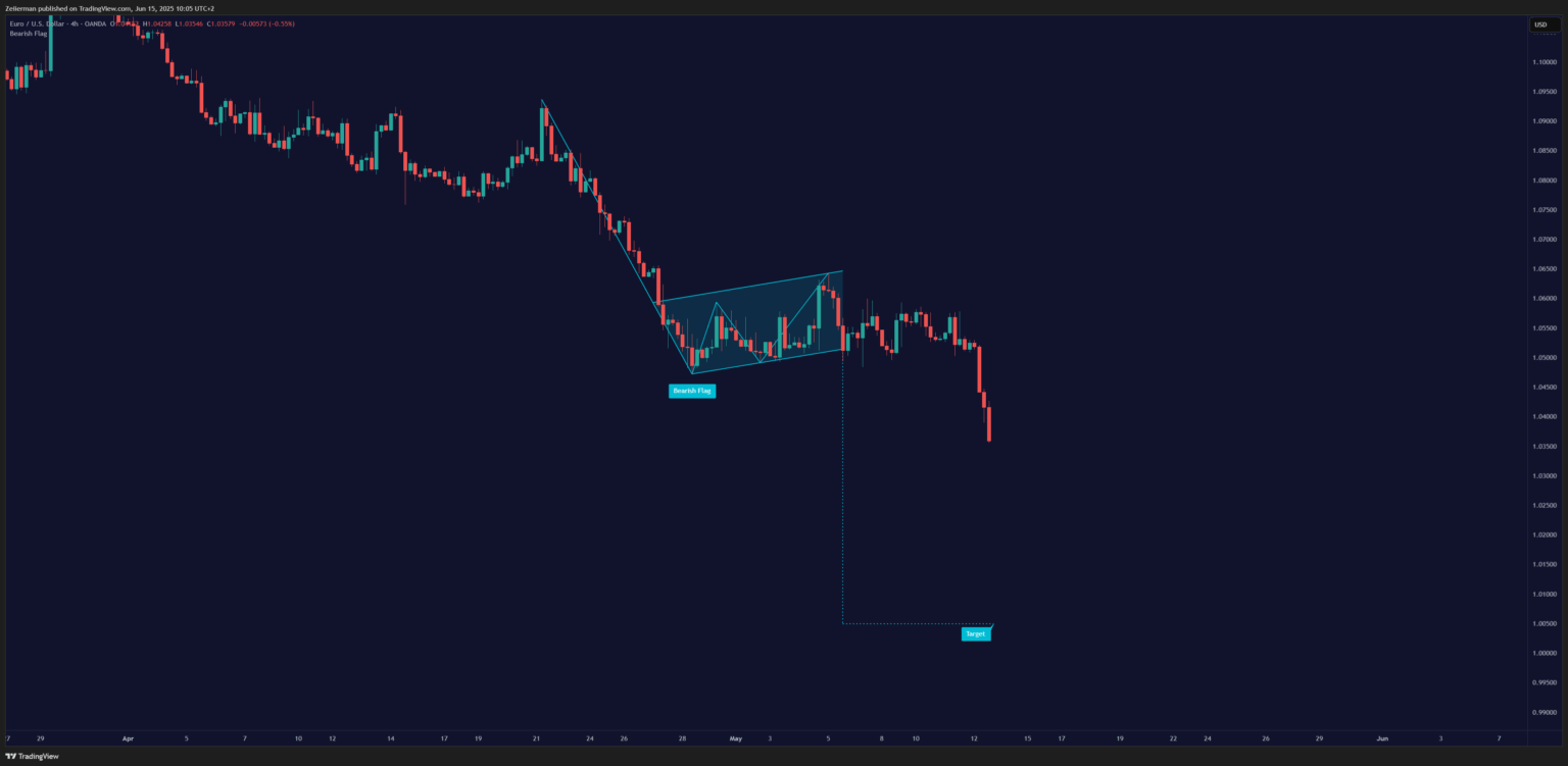
The key with flags is timing. They typically resolve within 1-3 weeks. If they drag on longer, they often fail. Think of them as temporary pauses, not permanent stops.
📌 When following a flag, it’s best to enter on the breakout with a target equal to the length of the flagpole projected from the breakout point.
6. Ascending and Descending Triangles
Triangles are the Swiss Army knives of chart patterns – they come in different varieties and show up everywhere. I use triangles because they often show clear pressure building. As with most patterns, there are two types:
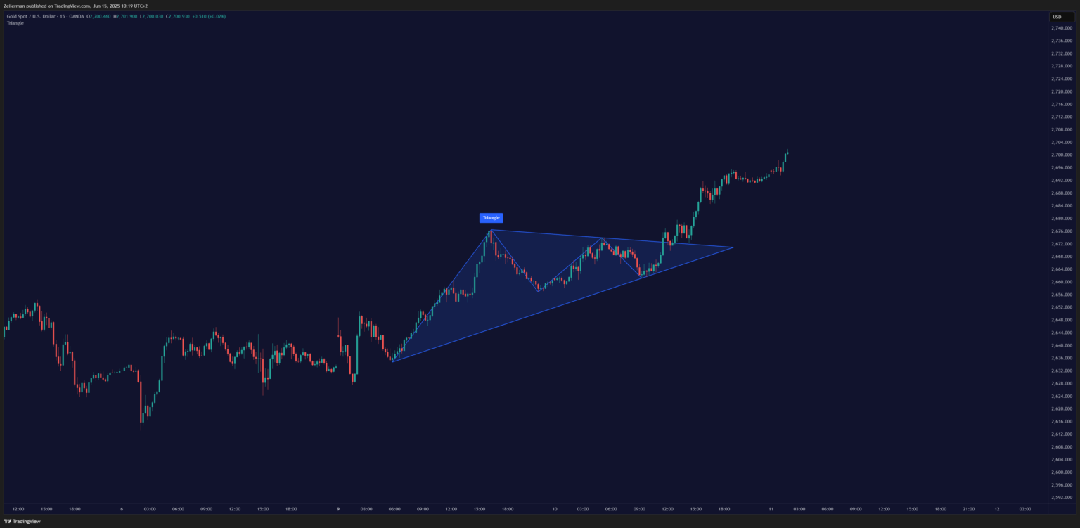
Ascending Triangle: Picture a series of higher lows bumping up against a flat resistance level. It’s like water building up behind a dam – eventually, something’s got to give. The flat top shows strong resistance, but the higher lows indicate that buyers are becoming more aggressive. At the next step, breakouts occur because buyers absorb all the available supply at the resistance level. Volume should typically contract in a pattern and expand on breakout.
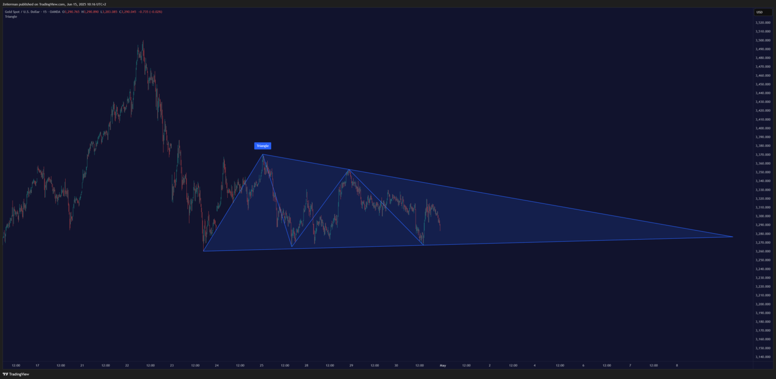
Descending Triangle: It’s the bearish cousin of the ascending triangle. You’ve got lower highs running into a flat support level. Each bounce gets weaker, suggesting that the support level is about to crack.
📌 Use these patterns in conjunction with support and resistance zones. Breakouts near key levels are almost always stronger. It’s super rare to find perfect triangles, some sort of angle must be tolerated
For precision in finding the zone, you can choose any Support & Resistance Indicators that suit your trade setup.
Read: How to start trading with TradingView? Setting Yourself Up for Success7. Pennants
Pennants are hyperactive little brothers of flag patterns. They are symmetrical triangles that form after explosive moves (the “pole”). Unlike flags, trendlines converge in a pennant pattern. It means they represent extreme compression before continuation.
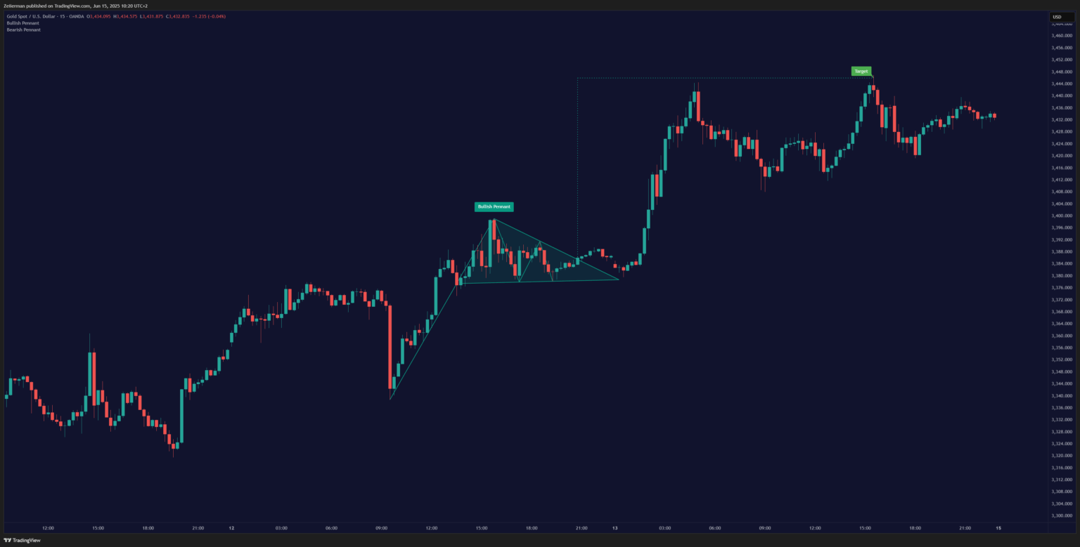
The consolidation in a pennant is shorter and tighter than in a flag, usually lasting just 1-2 weeks. Volume dries up during this formation and explodes on the breakout. You will see a consistent breakout, which is a continuation of the previous trend.
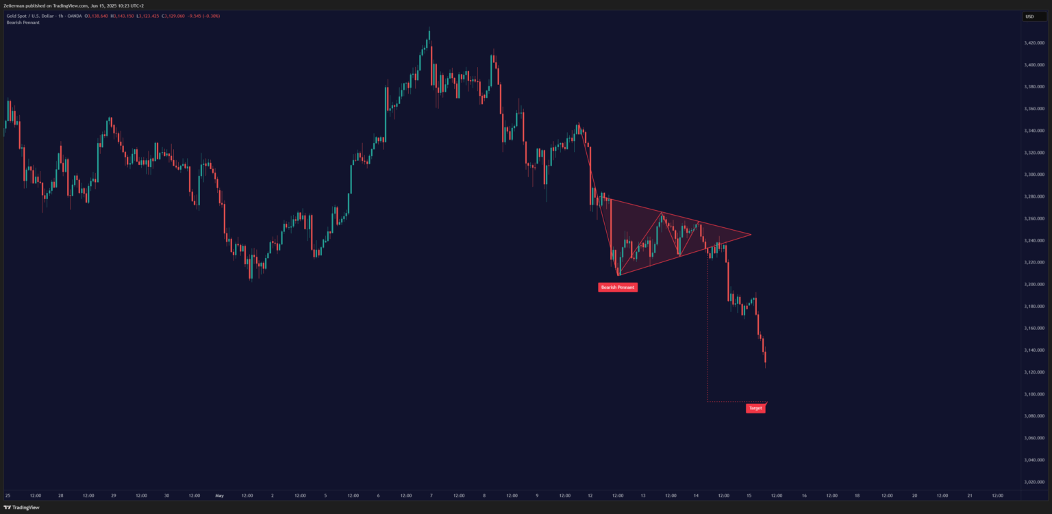
📌 Pennants work best in fast-moving markets like crypto or during earnings season in stocks.
8. Ross Hook
The Ross Hook is a lesser-known but incredibly powerful continuation pattern developed by trader Joe Ross. It’s about catching the market when it’s “hooking” back into the trend after a brief pause. Ross Hook is the first pullback — and a great place to enter before the next leg up (or down).
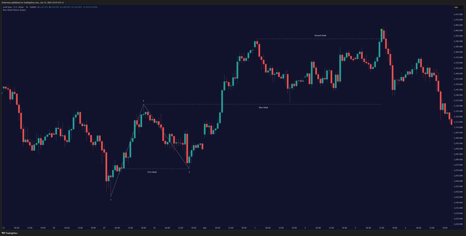
Here’s the setup:
- The market is in a clear trend
- Price makes a small pullback against the trend
- Price breaks above the high of the pullback bar (for uptrends) or below the low (for downtrends)
- This breakout is your “hook” – the entry signal
The Ross Hook is beautiful because it allows you to get into trends early with tight risk management. Your stop loss is positioned just beyond the pullback extreme, keeping your risk small relative to the potential reward.
Top Candlestick Patterns for Trend Changes
Candlestick patterns are akin to reading the market’s emotions bar by bar. These single or multi-bar formations often signal major turning points by hinting when a trend is tired or ready to reverse.
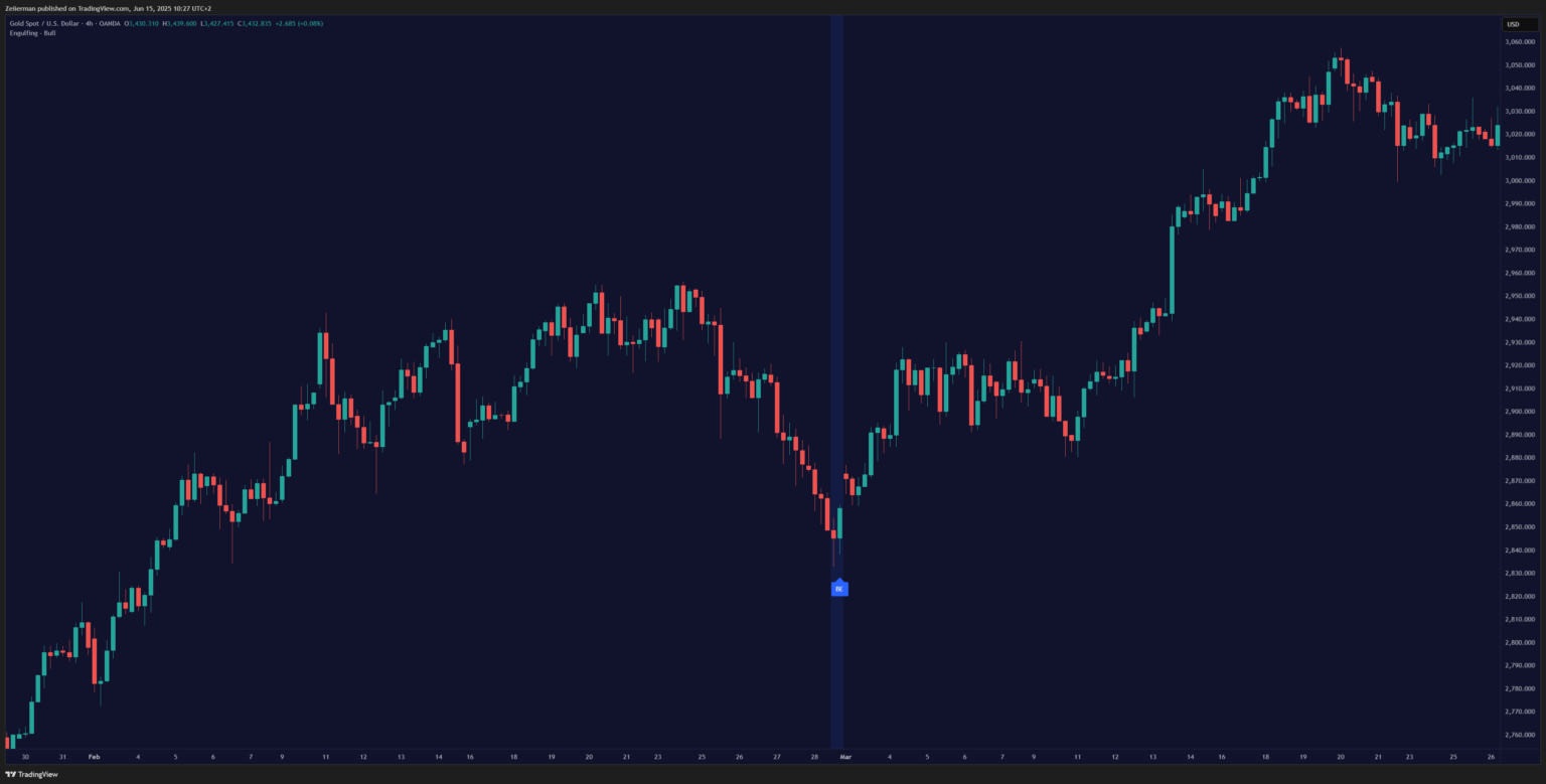
9. Engulfing Patterns
I always believed that engulfing patterns are the market’s way of showing complete dominance. One candle literally swallows the previous one whole.
In a bullish engulfing pattern, a small red candle is followed by a large green one that completely engulfs it. It’s as if the bears had control yesterday, but the bulls just showed up with a mission.
Conversely, in a bearish engulfing pattern, a small green candle is followed by a large red candle that completely engulfs it. This time, the bulls thought they were in charge, but the bears just took over the whole building.
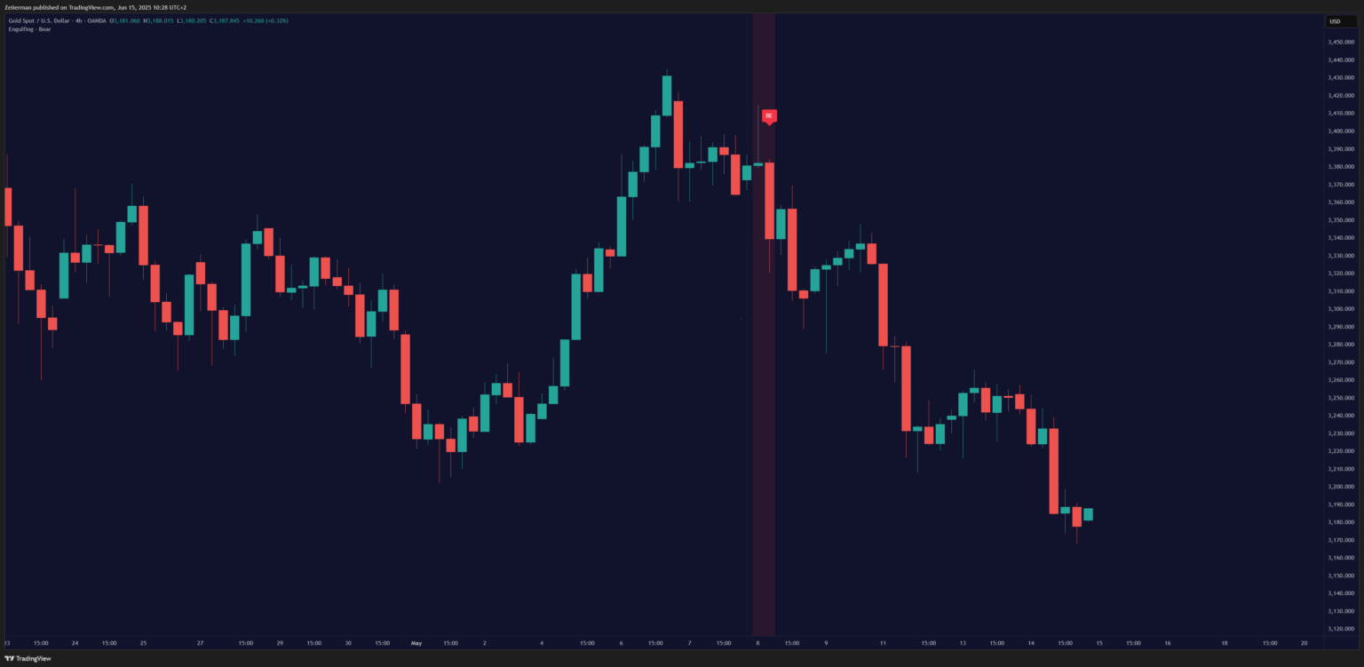
📌 Context is truly the key here. Engulfing patterns are most powerful when they occur at key support or resistance levels or after extended price movements.
Read: The Philosophy of Selling Technical Indicators10. Hammer (Pin Bar)
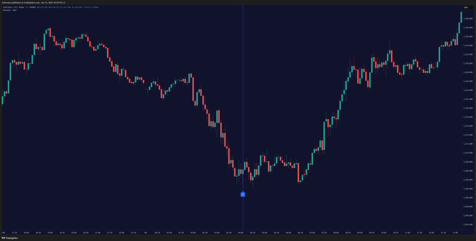
You’ve probably seen this one before — small body, long lower wick. It shows that the price dipped but got quickly bought up. The story it tells is beautiful: sellers pushed the price way down during the session, but buyers stepped in aggressively and pushed it all the way back up. It shows the rejection of lower prices.
Things to remember:
- The hammer should appear after a downtrend
- The longer, the lower shadow, the more significant
- Colour doesn’t matter as much as the shape
- Volume should be above average
📌 Hammers near support zones are far more powerful. It’s best not to trade them in isolation.
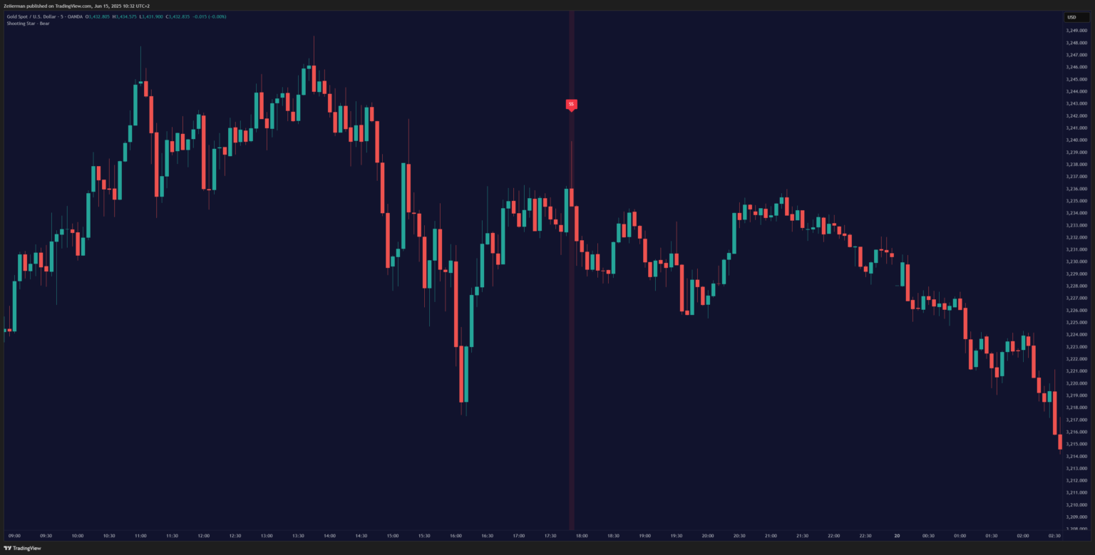
11. Shooting Star / Hanging Man
These patterns are the hammer’s evil twins – the same shape but flipped upside down. They look similar but mean different things based on the trend context.
Shooting Star appears after an uptrend. Small body at the bottom with a long upper shadow. It’s like the market tried to go higher but got shot down. Sellers stepped in hard when the price got too high. It shows a failed breakout (“trapped bulls”).
Hanging Man is the same shape as a hammer but appears after an uptrend instead of a downtrend. Despite the bullish appearance (small body, long lower shadow), it’s actually bearish because it shows up in the wrong context.
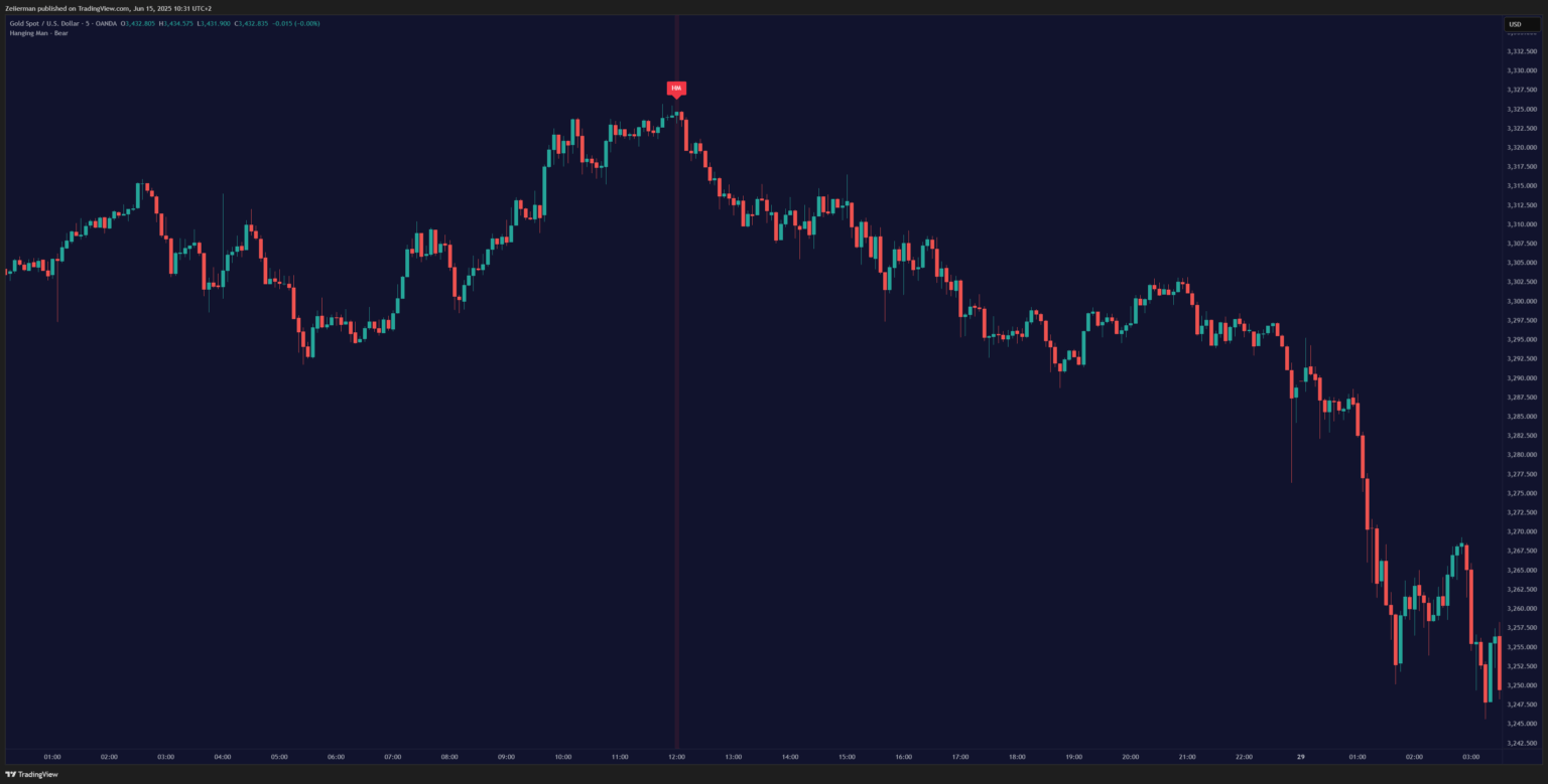
📌 Again, context is everything here, so never rely on these patterns in isolation. I always include them as part of a broader confirmation setup, which also includes reliable indicators and other confluences.
Conclusion
Learning chart patterns is step one. But mastery comes from context, timing, and confirmation. The traders making serious money in 2025 aren’t the ones with the fanciest setup or the most monitors. They’re the ones who understand that markets move in patterns, and those patterns repeat because people never change.
Zeiierman
With over 16 years in the market, Zeiierman has extensive experience as a full-time trader and risk advisory consultant for hedge funds. He has developed many profitable trading strategies, drawing on his background in risk management and strategy execution.
More from Zeiierman